Constructing a Classifier

In machine learning, classification involves using the features of a dataset to divide it into a specific number of classes. This is different from regression, where the output is a real number. A classifier is any algorithm that performs classification. In simple cases, this classifier can be a basic mathematical function; in more real-world cases, it can become very complex. Classification can be binary or split into multiple classes, meaning we separate data into more than two classes.
Evaluating the accuracy of a classifier is an important step in the world of machine learning. We need to learn how to use the available data to understand how this model will perform in the real world. In this chapter, we will look at recipes that address all these aspects.
Building a simple classifier
We will create a simple_classfier.py file, just like we have done previously. In the file, you can type in as follows:
import numpy as np
import matplotlib.pyplot as plt

# Sample data
X = np.array([[3, 1], [2, 5], [1, 8], [6, 4], [5, 2], [3, 5], [4, 7], [4, -1]])
y = [0, 1, 1, 0, 0, 1, 1, 0]  # Labels for the data points

# Separate data into classes, namely class0 and class_1
class_0 = np.array([X[i] for i in range(len(X)) if y[i] == 0])  # Points labeled as 0
class_1 = np.array([X[i] for i in range(len(X)) if y[i] == 1])  # Points labeled as 1

# Plot the data
plt.figure(figsize=(8, 6))
plt.scatter(class_0[:, 0], class_0[:, 1], color='black', marker='s', label='Class 0')
plt.scatter(class_1[:, 0], class_1[:, 1], color='green', marker='x', label='Class 1')
plt.xlabel('Feature 1')
plt.ylabel('Feature 2')
plt.title('Scatter Plot of Two Classes')
plt.legend()
plt.grid(True)
plt.show()
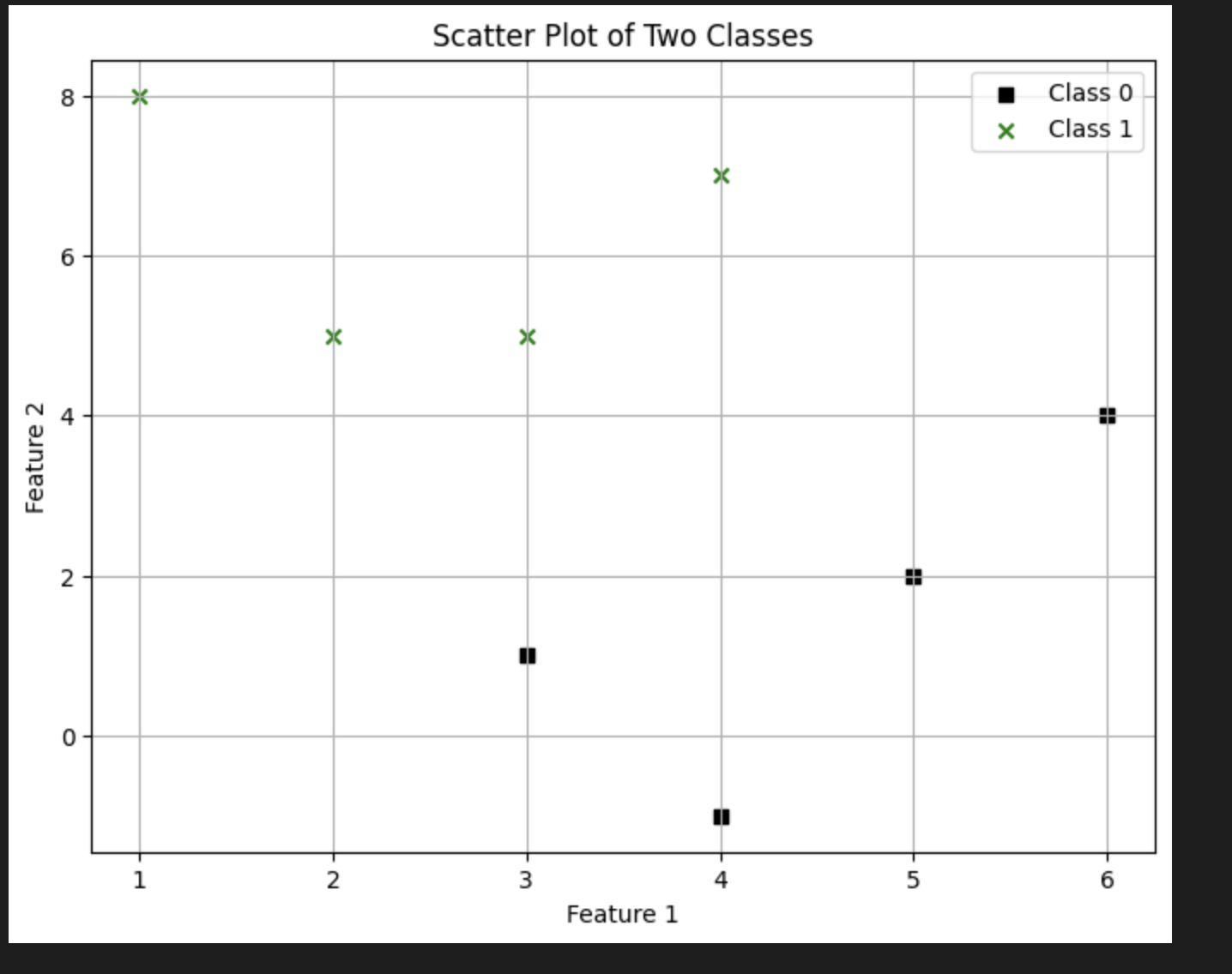
This is a scatterplot for both classes in the sample data we used. Squares and crosses are used to denote the points, representing class 0 and class 1 respectively. The next step we can do is to draw a line dividing these two subsets of the sample data.
In addition to the code above we can add the following to the code:

line_x = range(10)
line_y = line_x

plt.figure()
plt.scatter(class_0[:,0], class_0[:,1], color='black', marker='s')
plt.scatter(class_1[:,0], class_1[:,1], color='black', marker='x')
plt.plot(line_x, line_y, color='black', linewidth=3)
plt.show()
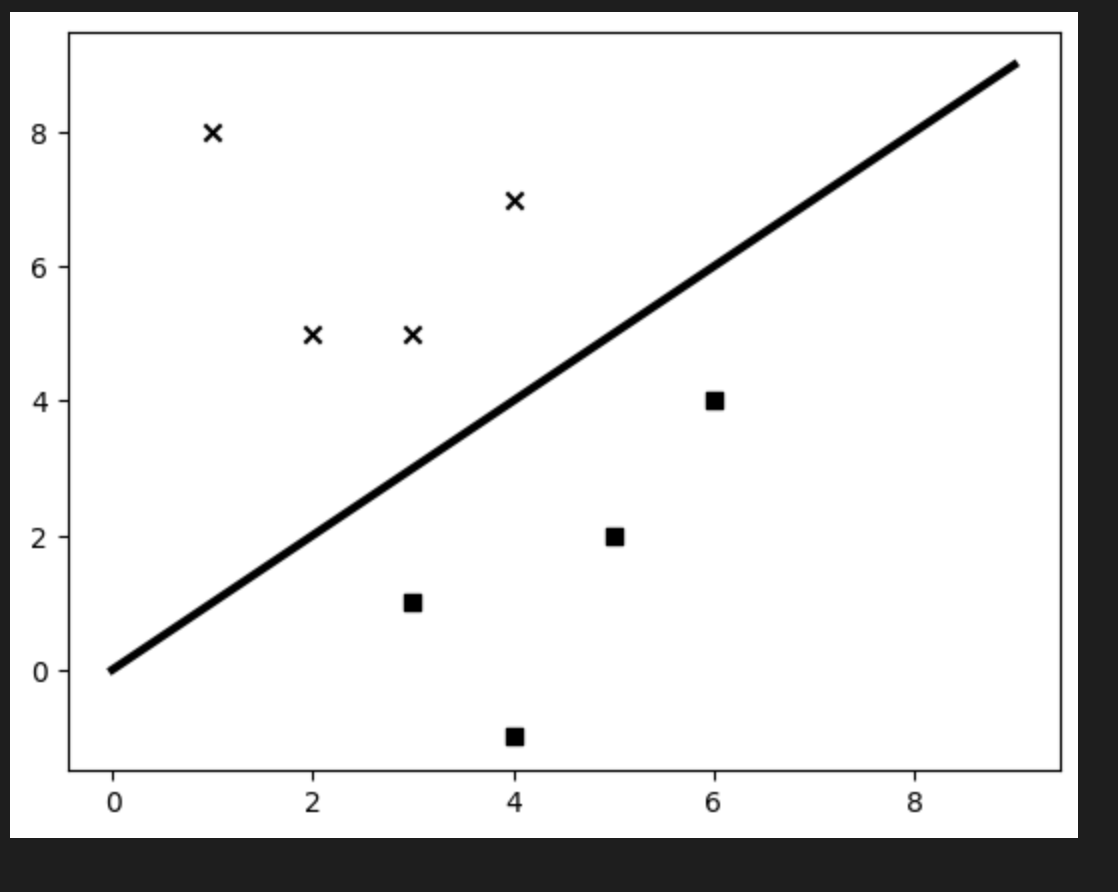
After running the code, we can see that the line evenly divides the two classes. We created a simple classifier using this rule: the input point (a, b) belongs to class_0 if a is greater than or equal to b; otherwise, it belongs to class_1. If you check the points one by one, you'll see this is true. That's it! You've just built a linear classifier that can sort unknown data. It's called a linear classifier because the dividing line is straight. If it were a curve, it would be a nonlinear classifier.
Building a Logistic Regression Classifier
Given a set of data points, the goal is to build a model that can draw straight lines to separate our classes. It finds these lines by solving equations based on the training data. Let us see how we can do this in Python. Create a file, logistic_regression.py, and add the following code:
import numpy as np
from sklearn.linear_model import LogisticRegression
import matplotlib.pyplot as plt

# Sample data
X = np.array([[4, 7], [3.5, 8], [3.1, 6.2], [0.5, 1], [1, 2],
              [1.2, 1.9], [6, 2], [5.7, 1.5], [5.4, 2.2]])
y = np.array([0, 0, 0, 1, 1, 1, 2, 2, 2])  # Three classes: 0, 1, 2

# Initialize the logistic regression classifier
classifier = LogisticRegression(multi_class='ovr', solver='lbfgs')

# Train the classifier
classifier.fit(X, y)

# Function to plot the classifier's decision boundary and data points
def plot_classifier(classifier, X, y):
    # Define ranges to plot the figure
    x_min, x_max = min(X[:, 0]) - 1.0, max(X[:, 0]) + 1.0
    y_min, y_max = min(X[:, 1]) - 1.0, max(X[:, 1]) + 1.0

    # Step size for the mesh grid
    step_size = 0.01

    # Define the mesh grid
    x_values, y_values = np.meshgrid(np.arange(x_min, x_max, step_size),
                                     np.arange(y_min, y_max, step_size))

    # Predict the classifier's output for each point in the grid
    mesh_output = classifier.predict(np.c_[x_values.ravel(), y_values.ravel()])
    mesh_output = mesh_output.reshape(x_values.shape)

    # Plot the decision boundary
    plt.figure(figsize=(10, 6))
    plt.contourf(x_values, y_values, mesh_output, alpha=0.5, cmap='coolwarm')

    # Plot the data points
    plt.scatter(X[:, 0], X[:, 1], c=y, edgecolor='k', cmap='coolwarm', marker='o', s=80)
    plt.xlabel('Feature 1')
    plt.ylabel('Feature 2')
    plt.title('Classifier Decision Boundary with Data Points')
    plt.show()

# Call the function to plot
plot_classifier(classifier, X, y)
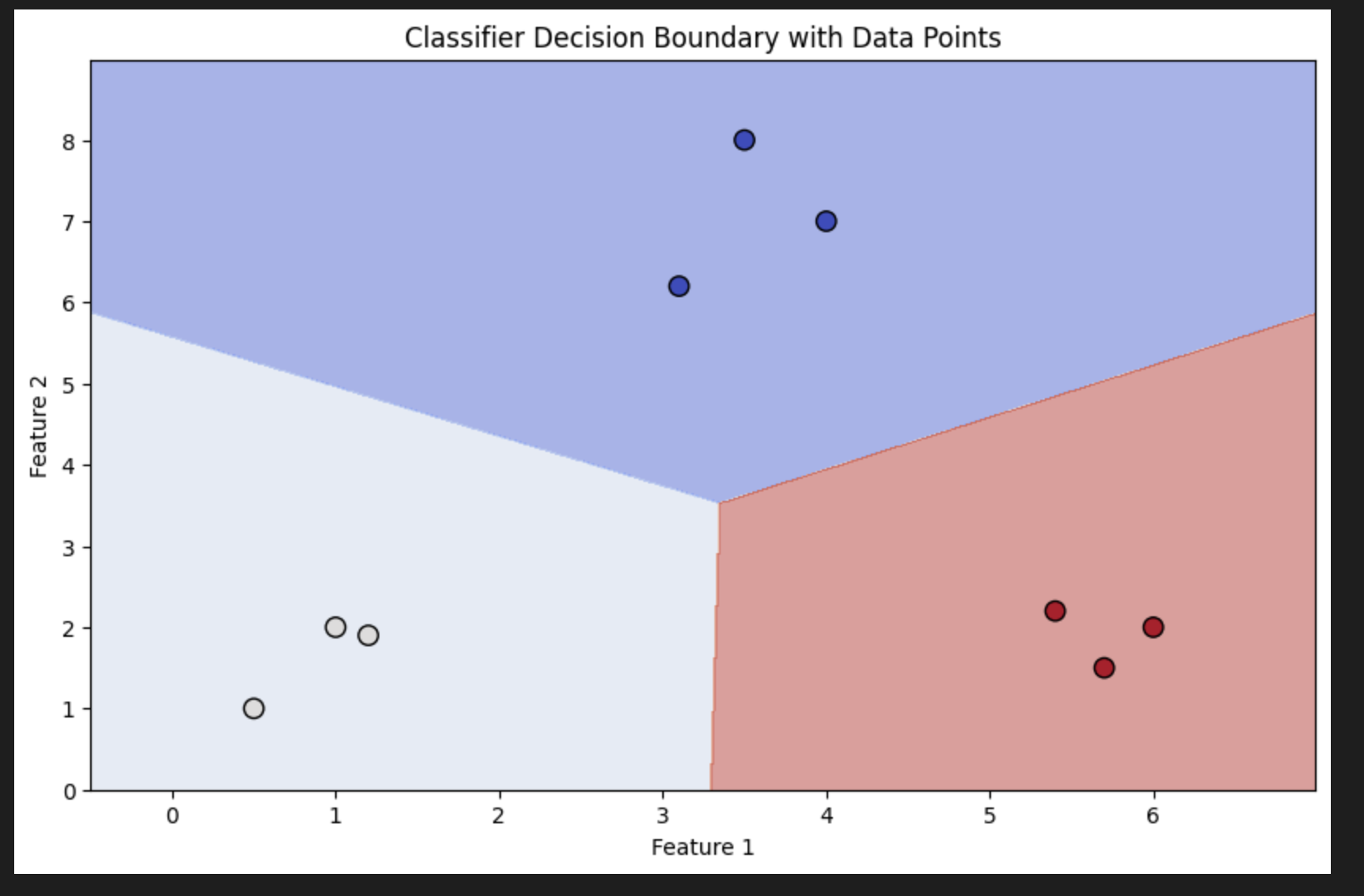
Building a Naive Bayes Classifier
In simple terms, a Naive Bayes classifier is a supervised learning classifier that uses the Bayes theorem to build the model. We can build the following as follows. Create a new file naive_bayes.py
We can use the same insurance dataset from Kaggle.
import pandas as pd
import numpy as np
import matplotlib.pyplot as plt
from sklearn.model_selection import train_test_split
from sklearn.naive_bayes import GaussianNB
from sklearn.metrics import accuracy_score, classification_report, confusion_matrix
from sklearn.preprocessing import LabelEncoder
import seaborn as sns

# Step 1: Load the insurance dataset
filename = "/Users/frosthash/Downloads/insurance.csv"
data = pd.read_csv(filename)

# Step 2: Data Preprocessing
# Encode categorical variables (sex, smoker, region)
label_encoder = LabelEncoder()

# Encode 'sex', 'smoker', and 'region' columns
data['sex'] = label_encoder.fit_transform(data['sex'])  # Convert 'female' and 'male' to numeric
data['smoker'] = label_encoder.fit_transform(data['smoker'])  # Convert 'yes' and 'no' to numeric
data['region'] = label_encoder.fit_transform(data['region'])  # Convert region names to numeric

# Step 3: Extract features and target variable
# We will use 'age' and 'bmi' for plotting decision boundaries
X = data[['age', 'bmi']].values  # Features (just 'age' and 'bmi')
y = data['smoker'].values  # Target variable (smoker or not)

# Step 4: Split the data into training and testing sets
X_train, X_test, y_train, y_test = train_test_split(X, y, test_size=0.2, random_state=42)

# Step 5: Train the Naive Bayes classifier
naive_bayes_classifier = GaussianNB()
naive_bayes_classifier.fit(X_train, y_train)

# Step 6: Make predictions on the test set
y_pred = naive_bayes_classifier.predict(X_test)

# Step 7: Evaluate the model
accuracy = accuracy_score(y_test, y_pred)
print(f"Accuracy: {accuracy:.2f}")
print("\nClassification Report:")
print(classification_report(y_test, y_pred, target_names=['Non-Smoker', 'Smoker']))

# Step 8: Plot the confusion matrix
conf_matrix = confusion_matrix(y_test, y_pred)

# Plotting the confusion matrix using seaborn heatmap
plt.figure(figsize=(6, 5))
sns.heatmap(conf_matrix, annot=True, fmt='d', cmap='Blues', xticklabels=['Non-Smoker', 'Smoker'], yticklabels=['Non-Smoker', 'Smoker'])
plt.title('Confusion Matrix')
plt.xlabel('Predicted')
plt.ylabel('Actual')
plt.show()

# Step 9: Plot the decision boundaries for Naive Bayes classifier
# Create a mesh grid for the plot
x_min, x_max = X[:, 0].min() - 1, X[:, 0].max() + 1
y_min, y_max = X[:, 1].min() - 1, X[:, 1].max() + 1
xx, yy = np.meshgrid(np.arange(x_min, x_max, 0.1), np.arange(y_min, y_max, 0.1))

# Predict the label for each point in the mesh grid
Z = naive_bayes_classifier.predict(np.c_[xx.ravel(), yy.ravel()])
Z = Z.reshape(xx.shape)

# Plot the decision boundary and the points
plt.figure(figsize=(8, 6))
plt.contourf(xx, yy, Z, alpha=0.75, cmap=plt.cm.coolwarm)
plt.scatter(X[:, 0], X[:, 1], c=y, edgecolors='k', marker='o', cmap=plt.cm.coolwarm, label='Data Points')
plt.title('Naive Bayes Decision Boundaries')
plt.xlabel('Age')
plt.ylabel('BMI')
plt.legend()
plt.show()
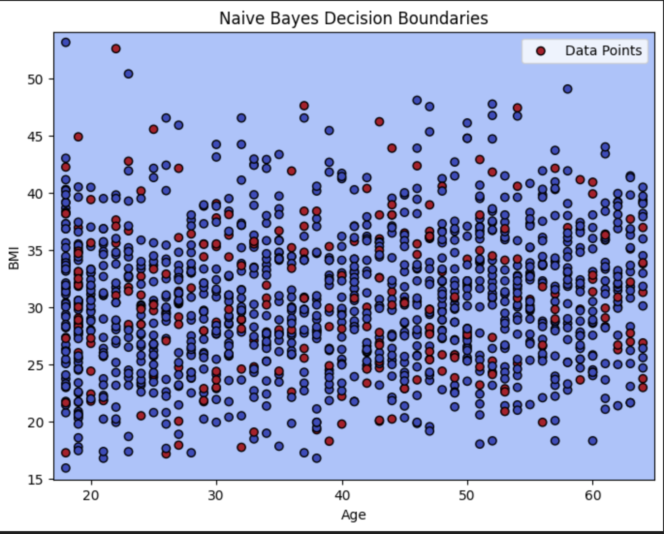
Confusion Matrix
A confusion matrix is a table that we use to understand the performance of a classification model. This helps us understand how we classify testing data into different classes. When we want to fine-tune our algorithms, we need to understand how the data gets misclassified before we make these changes. Using this dataset, we want to predict
Where:
TN (True Negative): The number of non-smokers that the model correctly predicted as non-smokers.
FP (False Positive): The number of non-smokers that the model incorrectly predicted as smokers.
FN (False Negative): The number of smokers that the model incorrectly predicted as non-smokers.
TP (True Positive): The number of smokers that the model correctly predicted as smokers.
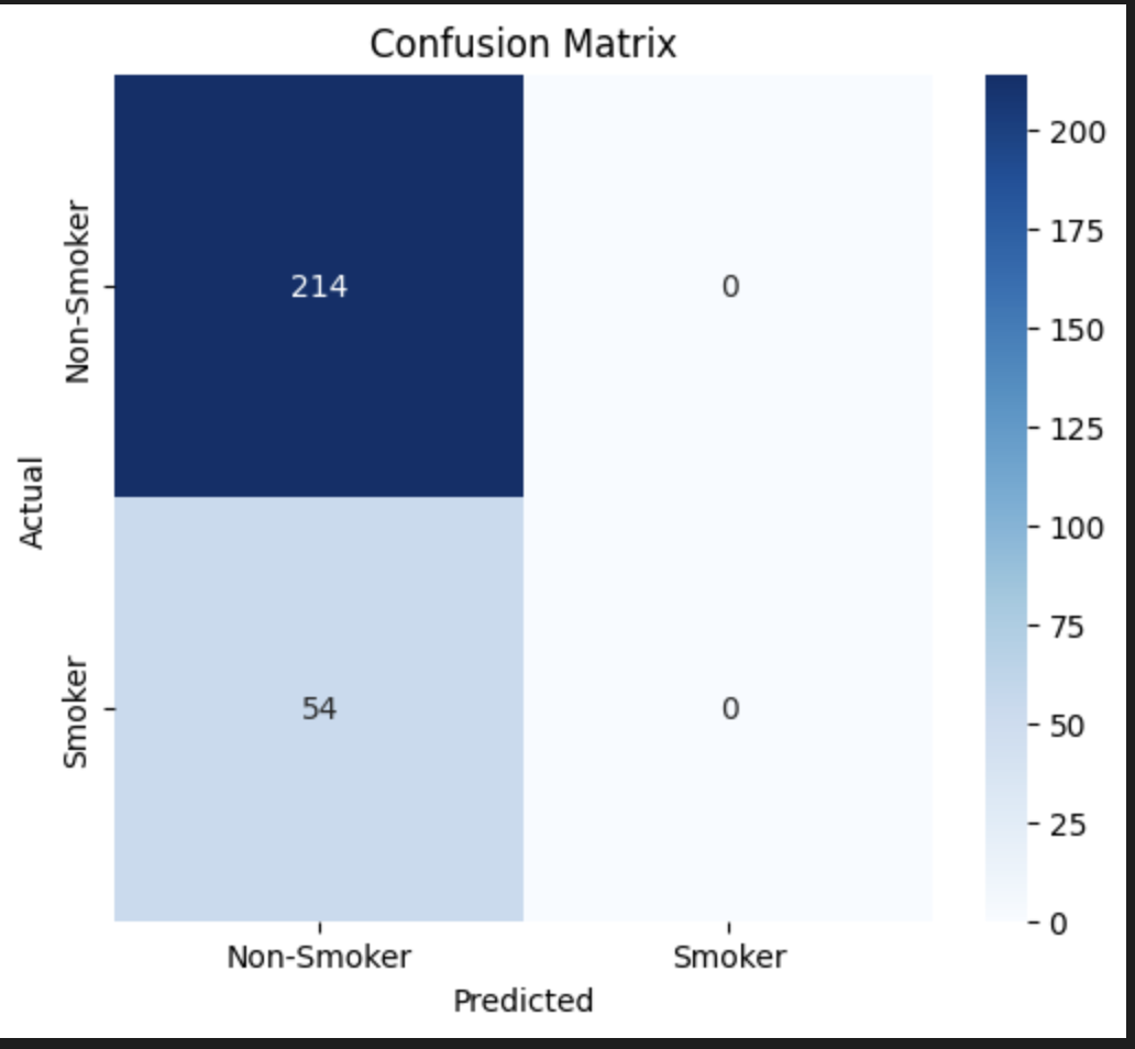
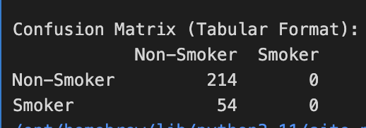
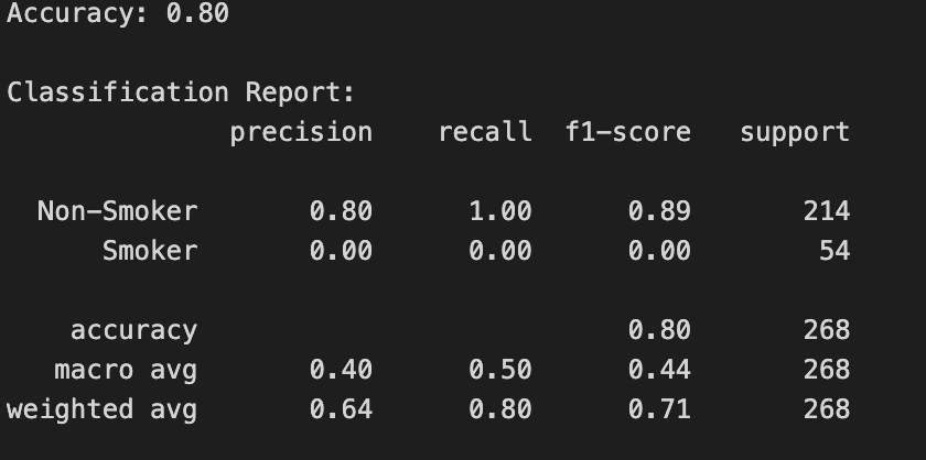
Accuracy: The model achieved an accuracy of 80%, meaning it correctly classified 80% of instances overall.
Non-Smoker Class:
Precision: 80% — Correctly identified 80% of instances predicted as Non-Smokers.
Recall: 100% — Identified all Non-Smokers correctly.
F1 Score: 89% — Balanced performance for the Non-Smoker class.
Smoker Class:
Precision: 0% — Did not correctly identify any Smokers, all predictions were false positives.
Recall: 0% — Did not identify any Smokers, missing all of them.
F1 Score: 0% — Poor performance for the Smoker class.
Macro Average:
Precision: 40% — Reflects the imbalance, as the model performs poorly on Smokers.
Recall: 50% — The model's ability to identify instances across both classes is moderate.
F1 Score: 44% — Overall weak performance across both classes.
Weighted Average:
Precision: 64% — Higher due to the better performance of Non-Smokers.
Recall: 80% — Good recall for Non-Smokers.
F1 Score: 71% — Optimistic due to the model's good performance for Non-Smokers.
The full code is as follows
import pandas as pd
import numpy as np
import matplotlib.pyplot as plt
from sklearn.model_selection import train_test_split
from sklearn.naive_bayes import GaussianNB
from sklearn.metrics import accuracy_score, classification_report, confusion_matrix
from sklearn.preprocessing import LabelEncoder
import seaborn as sns

# Step 1: Load the insurance dataset
filename = "/Users/frosthash/Downloads/insurance.csv"
data = pd.read_csv(filename)

# Step 2: Data Preprocessing
# Encode categorical variables (sex, smoker, region)
label_encoder = LabelEncoder()

# Encode 'sex', 'smoker', and 'region' columns
data['sex'] = label_encoder.fit_transform(data['sex'])  # Convert 'female' and 'male' to numeric
data['smoker'] = label_encoder.fit_transform(data['smoker'])  # Convert 'yes' and 'no' to numeric
data['region'] = label_encoder.fit_transform(data['region'])  # Convert region names to numeric

# Step 3: Extract features and target variable
# We will use all columns except 'charges' as features for classification
X = data[['age', 'sex', 'bmi', 'children', 'region']].values  # Features
y = data['smoker'].values  # Target variable (smoker or not)

# Step 4: Split the data into training and testing sets
X_train, X_test, y_train, y_test = train_test_split(X, y, test_size=0.2, random_state=42)

# Step 5: Train the Naive Bayes classifier
naive_bayes_classifier = GaussianNB()
naive_bayes_classifier.fit(X_train, y_train)

# Step 6: Make predictions on the test set
y_pred = naive_bayes_classifier.predict(X_test)

# Step 7: Evaluate the model
accuracy = accuracy_score(y_test, y_pred)
print(f"Accuracy: {accuracy:.2f}")
print("\nClassification Report:")
# We specify the labels for the classification report based on the target variable
target_names = ['Non-Smoker', 'Smoker']
print(classification_report(y_test, y_pred, target_names=target_names))

# Step 8: Plot the confusion matrix
conf_matrix = confusion_matrix(y_test, y_pred)

# Create confusion matrix dataframe for better visualization
conf_matrix_df = pd.DataFrame(conf_matrix, index=target_names, columns=target_names)

# Print confusion matrix as a table
print("\nConfusion Matrix (Tabular Format):")
print(conf_matrix_df)

# Plotting the confusion matrix using seaborn heatmap
plt.figure(figsize=(6, 5))
sns.heatmap(conf_matrix, annot=True, fmt='d', cmap='Blues', xticklabels=target_names, yticklabels=target_names)
plt.title('Confusion Matrix')
plt.xlabel('Predicted')
plt.ylabel('Actual')
plt.show()
In the next blog, we will cover extracting validation curves on testing and training datasets and deep dive into predictive modeling.
Sincerely, Frosthash
Education, Execution, and Consistency


